Как реализовать закругления уголков у фигуры CSS?
Я пробую так, но не получается добиться скругления, как на скрине.
body {
  padding: 15px;
}

.arrow {
  background: #8ec63f;
  color: #fff;
  display: inline-block;
  height: 30px;
  line-height: 30px;
  padding: 0 30px 0 10px;
  min-width: 120px;
  position: relative;
  border-radius: 4px;
  border: 1px solid #8ec63f;

}

.arrow:before {
  content: "";
  height: 0;
  position: absolute;
  width: 0;
}

.arrow:before {
  border-bottom: 15px solid transparent;
  border-right: 15px solid #8ec63f;
  border-top: 15px solid transparent;
  left: -15px;
}


.arrow:hover {
  background: #f7941d;
  color: #fff;
  border-radius: 4px;
  border: 1px solid #f7941d;
}

.arrow:hover:before {
  border-bottom: 15px solid transparent;
  border-top: 15px solid transparent;
  border-right: 15px solid #f7941d;
}
<a class="arrow" href="#">Continue Reading </a>Ответы (3 шт):
Самый простой способ получить закругленные уголки у любой фигуры CSS, без изменения вёрстки, это применить к фигуре svg фильтр.
Добавлен фильтр в CSS
.arrow {
filter:url(#goo)
}
В шапке svg для кода фильтра установлено width="0"и height="0". Это сделано, чтобы скрыть svg и не мешать вёрстке.
Радиус закругления можно регулировать с помощью stdDeviation="3"
body {
  padding: 15px;
}

.arrow {
  background: #8ec63f;
  color: #fff;
  display: inline-block;
  height: 30px;
  line-height: 30px;
  padding: 0 30px 0 10px;
  min-width: 120px;
  position: relative;
  border-radius: 4px;
  border: 1px solid #8ec63f;
  filter:url(#goo);

}

.arrow:before {
  content: "";
  height: 0;
  position: absolute;
  width: 0;
}

.arrow:before {
  border-bottom: 15px solid transparent;
  border-right: 15px solid #8ec63f;
  border-top: 15px solid transparent;
  left: -15px;
}


.arrow:hover {
  background: #f7941d;
  color: #fff;
  border-radius: 4px;
  border: 1px solid #f7941d;
}

.arrow:hover:before {
  border-bottom: 15px solid transparent;
  border-top: 15px solid transparent;
  border-right: 15px solid #f7941d;
}
<a class="arrow" href="#">Continue Reading </a>
<svg version="1.1" xmlns="http://www.w3.org/2000/svg" xmlns:xlink="http://www.w3.org/1999/xlink"
width="0" height="0" >
<defs>
<filter id="goo"><feGaussianBlur in="SourceGraphic" stdDeviation="3" result="blur" />
<feColorMatrix in="blur" mode="matrix"
values="
1 0 0 0 0
0 1 0 0 0
0 0 1 0 0
0 0 0 29 -1"
result="goo" />
<feComposite in="SourceGraphic" in2="goo" operator="atop"/>
</filter>
</defs>
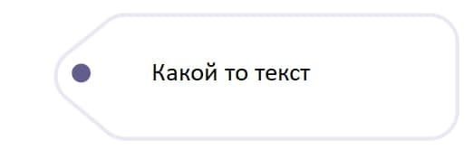
</svg>Стандартное решение - использование псевдоэлементов, border-radius и transform: rotate() :
.label {
  position: relative;
  left: 59px; top: 15px;
  display: flex;
  justify-content: center;
  align-items: center;
  height: 140px; width: 448px;
  border-radius: 33px;
  text-decoration: none;
}

.label::before,
.label::after {
  content: "";
  position: absolute;
  z-index: -1;
  box-sizing: border-box;
  border: 4px solid #e7e6ec;
}

.label::before {
  top: 50%; right: 377px;
  height: 118px; width: 118px;
  border-radius: 33px;
  transform-origin: center;
  transform: translate(50%, -50%) rotate(-45deg);
  background-image: radial-gradient( circle at 1.6em 1.6em, #615e8d 0.6em, #fff 0.65em);
}

.label::after {
  top: 0; right: 0;
  height: 140px; width: 377px;
  border-left-width: 0;
  border-radius: 0 33px 33px 0;
  background-color: #fff;
}

.label>span {
  font: 24px/1.3em sans-serif;
  color: #000;
}
<a class="label" href="#"><span>Какой-то текст</span></a>Другие фигуры CSS
Во всех примерах берутся фигуры CSS и уголки закругляются с помощью фильтра SVG - feColorMatrix
<filter id="goo"><feGaussianBlur in="SourceGraphic" stdDeviation="3" result="blur" />
            <feColorMatrix in="blur" mode="matrix"
                values="
                  1 0 0 0 0
                  0 1 0 0 0
                  0 0 1 0 0
                  0 0 0 29 -1"
                  result="goo" />
            <feComposite in="SourceGraphic" in2="goo" operator="atop"/>
</filter>
Первая фигура это образец, ниже та же фигура - .round с закругленными уголками.
#1. Треугольник вершиной вверх
.triangle {
width: 0;
height: 0;
border-left: 50px solid transparent;
border-right: 50px solid transparent;
border-bottom: 100px solid #24375B;

}
.round {
width: 0;
height: 0;
border-left: 50px solid transparent;
border-right: 50px solid transparent;
border-bottom: 100px solid #24375B;
margin-top:1em;
filter:url(#goo);
}
<div class="triangle"></div>
<div class="round"></div>
<a class="arrow" href="#"></a>
<svg version="1.1" xmlns="http://www.w3.org/2000/svg" xmlns:xlink="http://www.w3.org/1999/xlink"
width="0" height="0" >
<defs>
<filter id="goo"><feGaussianBlur in="SourceGraphic" stdDeviation="3" result="blur" />
<feColorMatrix in="blur" mode="matrix"
values="
1 0 0 0 0
0 1 0 0 0
0 0 1 0 0
0 0 0 29 -1"
result="goo" />
<feComposite in="SourceGraphic" in2="goo" operator="atop"/>
</filter>
</defs>
</svg>#2. Прямоугольный треугольник
.triangle90 {
width: 0;
height: 0;
border-top: 100px solid #68B8AE;
border-right: 100px solid transparent;
}
.round {
width: 0;
height: 0;
border-top: 100px solid #68B8AE;
border-right: 100px solid transparent;
margin-top:3em;
filter:url(#goo);
}
<div class="triangle90"></div>
<div class="round"></div>
<a class="arrow" href="#"></a>
<svg version="1.1" xmlns="http://www.w3.org/2000/svg"   xmlns:xlink="http://www.w3.org/1999/xlink"
     width="0" height="0"  >
   <defs>
        <filter id="goo"><feGaussianBlur in="SourceGraphic" stdDeviation="3" result="blur" />
            <feColorMatrix in="blur" mode="matrix"
                values="
                  1 0 0 0 0
                  0 1 0 0 0
                  0 0 1 0 0
                  0 0 0 29 -1"
                  result="goo" />
            <feComposite in="SourceGraphic" in2="goo" operator="atop"/>
        </filter>
    </defs>
</svg>
#3. Трапеция
.trap {
height: 0;
width: 100px;
border-bottom: 100px solid purple;
border-left: 50px solid transparent;
border-right: 50px solid transparent;
}
.round {
height: 0;
width: 100px;
border-bottom: 100px solid purple;
border-left: 50px solid transparent;
border-right: 50px solid transparent;
margin-top:3em;
filter:url(#goo);
}
<div class="trap"></div>
<div class="round"></div>
<a class="arrow" href="#"></a>
<svg version="1.1" xmlns="http://www.w3.org/2000/svg" xmlns:xlink="http://www.w3.org/1999/xlink"
width="0" height="0" >
<defs>
<filter id="goo"><feGaussianBlur in="SourceGraphic" stdDeviation="5" result="blur" />
<feColorMatrix in="blur" mode="matrix"
values="
1 0 0 0 0
0 1 0 0 0
0 0 1 0 0
0 0 0 29 -1"
result="goo" />
<feComposite in="SourceGraphic" in2="goo" operator="atop"/>
</filter>
</defs>
</svg>#4. Шестиугольная звезда
.star {
width: 0;
height: 0;
margin-bottom: 30px;
border-left: 50px solid transparent;
border-right: 50px solid transparent;
border-bottom: 100px solid #374F9C;
position: relative;
}
.star:after {
content: "";
width: 0;
height: 0;
position: absolute;
top: 30px;
left: -50px;
border-left: 50px solid transparent;
border-right: 50px solid transparent;
border-top: 100px solid #374F9C;
}
.round {
width: 0;
height: 0;
margin-bottom: 30px;
border-left: 50px solid transparent;
border-right: 50px solid transparent;
border-bottom: 100px solid #374F9C;
position: relative;
margin-top:100px;
filter:url(#goo);

}
.round:after {
content: "";
width: 0;
height: 0;
position: absolute;
top: 20px;
left: -50px;
border-left: 50px solid transparent;
border-right: 50px solid transparent;
border-top: 85px solid #374F9C;
margin-top:1em;
filter:url(#goo);
}
<div class="star"></div>
<div class="round"></div>
<a class="arrow" href="#"></a>
<svg version="1.1" xmlns="http://www.w3.org/2000/svg" xmlns:xlink="http://www.w3.org/1999/xlink"
width="0" height="0" >
<defs>
<filter id="goo"><feGaussianBlur in="SourceGraphic" stdDeviation="2" result="blur" />
<feColorMatrix in="blur" mode="matrix"
values="
1 0 0 0 0
0 1 0 0 0
0 0 1 0 0
0 0 0 29 -1"
result="goo" />
<feComposite in="SourceGraphic" in2="goo" operator="atop"/>
</filter>
</defs>
</svg>#5. Стрелка
.arrow {
width: 60px;
height: 20px;
margin: 10px 0;
background: springgreen;
position: relative;
}
.arrow:after {
content: "";
width: 0;
height: 0;
position: absolute;
top: -10px;
left: 100%;
border-width: 20px 0 20px 40px;
border-style: solid;
border-color: transparent springgreen;
}
.round {
width: 60px;
height: 20px;
margin: 10px 0;
background: springgreen;
position: relative;
margin-top:2em;
filter:url(#goo);
}
.round:after {
content: "";
width: 0;
height: 0;
position: absolute;
top: -10px;
left: 100%;
border-width: 20px 0 20px 40px;
border-style: solid;
border-color: transparent springgreen;
}
<div class="arrow"></div>
<div class="round"></div>
<a class="arrow1" href="#"></a>
<svg version="1.1" xmlns="http://www.w3.org/2000/svg" xmlns:xlink="http://www.w3.org/1999/xlink"
width="0" height="0" >
<defs>
<filter id="goo"><feGaussianBlur in="SourceGraphic" stdDeviation="1" result="blur" />
<feColorMatrix in="blur" mode="matrix"
values="
1 0 0 0 0
0 1 0 0 0
0 0 1 0 0
0 0 0 29 -1"
result="goo" />
<feComposite in="SourceGraphic" in2="goo" operator="atop"/>
</filter>
</defs>
</svg>#6. Шестиугольник
.hexagon {
margin: 40px 0;
width: 100px;
height: 55px;
background: green;
position: relative;
}
.hexagon:before,
.hexagon:after {
content: "";
width: 0;
height: 0;
position: absolute;
left: 0;
border-left: 50px solid transparent;
border-right: 50px solid transparent;
}
.hexagon:before {
top: -25px;
border-bottom: 25px solid green;
}
.hexagon:after {
bottom: -25px;
border-top: 25px solid green;
}

.round {
margin: 70px 0;
width: 100px;
height: 55px;
background: green;
position: relative;
filter:url(#goo);
}
.round:before,
.round:after {
content: "";
width: 0;
height: 0;
position: absolute;
left: 0;
border-left: 50px solid transparent;
border-right: 50px solid transparent;
}
.round:before {
top: -25px;
border-bottom: 25px solid green;
}
.round:after {
bottom: -25px;
border-top: 25px solid green;
}
<div class="hexagon"></div>
<div class="round"></div>
<a class="arrow1" href="#"></a>
<svg version="1.1" xmlns="http://www.w3.org/2000/svg" xmlns:xlink="http://www.w3.org/1999/xlink"
width="0" height="0" >
<defs>
<filter id="goo"><feGaussianBlur in="SourceGraphic" stdDeviation="3" result="blur" />
<feColorMatrix in="blur" mode="matrix"
values="
1 0 0 0 0
0 1 0 0 0
0 0 1 0 0
0 0 0 29 -1"
result="goo" />
<feComposite in="SourceGraphic" in2="goo" operator="atop"/>
</filter>
</defs>
</svg>#7. Ромб
.diamond {
margin-bottom: 20px;
width: 0;
height: 0;
border: 50px solid transparent;
border-bottom: 70px solid #47002D;
position: relative;
top: -50px;
}
.diamond:after {
content: "";
width: 0;
height: 0;
position: absolute;
left: -50px;
top: 70px;
border: 50px solid transparent;
border-top: 70px solid #47002D;
}

.round {
margin-bottom: 20px;
width: 0;
height: 0;
border: 50px solid transparent;
border-bottom: 70px solid #47002D;
position: relative;
top: -50px;
margin-top:4em;
filter:url(#goo);
}
.round:after {
content: "";
width: 0;
height: 0;
position: absolute;
left: -50px;
top: 70px;
border: 50px solid transparent;
border-top: 70px solid #47002D;
}
<div class="diamond"></div>
<div class="round"></div>
<a class="arrow1" href="#"></a>
<svg version="1.1" xmlns="http://www.w3.org/2000/svg" xmlns:xlink="http://www.w3.org/1999/xlink"
width="0" height="0" >
<defs>
<filter id="goo"><feGaussianBlur in="SourceGraphic" stdDeviation="3" result="blur" />
<feColorMatrix in="blur" mode="matrix"
values="
1 0 0 0 0
0 1 0 0 0
0 0 1 0 0
0 0 0 29 -1"
result="goo" />
<feComposite in="SourceGraphic" in2="goo" operator="atop"/>
</filter>
</defs>
</svg>