как сделать, чтобы панель навигации при position: fixed занимала ширину родительского блока
как сделать, чтобы при positition: fixed сделать ширину навбара равной вмещающему блоку? html:
<div class="container">
        <nav class="nav">
          <div class="menu-btn">
            <span></span>
            <span></span>
            <span></span>
          </div>
          <ul class="nav-list">
            <li class="nav-items">
              <a class="nav-link" href="#summary">Summary</a>
            </li>
            <li class="nav-items">
              <a class="nav-link" href="#skills">Skills</a>
            </li>
            <li class="nav-items">
              <a class="nav-link" href="#education">Education</a>
            </li>
            <li class="nav-items">
              <a class="nav-link" href="#examples">Code examples</a>
            </li>
            <li class="nav-items">
              <a class="nav-link" href="#languages">Languages</a>
            </li>
            <li class="nav-items">
              <a class="nav-link" href="#contacts">Contacts</a>
            </li>
          </ul>
        </nav>
СSS:
body {
    font: normal 16px/25px 'Times New Roman', 'Times', 'Georgia', serif;
    margin: 0;
    max-width: 1200px;
}
.container{
    display: flex;
    flex-direction: column;
    margin: 0 20px;
    border: solid 1px black;
    background-color: #F0F5F9;
    border-bottom: none;
    border-top: none;
}
.nav{
    background-color:rgb(173, 173, 241);
    width: 100%;
    height: 50px;
    display: flex;
    flex-wrap: wrap;
    flex-direction: column;
    justify-content: center;
    border-top: solid 1px black;
    position:fixed;
    overflow: scroll;
    margin: 0 auto;
}

.menu-btn {
    width: 30px;
    height: 30px;
    position: fixed;
    right: 0;
    margin-right: 50px;
    z-index: 3;
    overflow: hidden;
    display: none;

}

.menu-btn span {
    width: 30px;
    height: 2px;
    position: absolute;
    top: 50%;
    left: 50%;
    transform: translate(-50%, -50%);
    background-color: #222222;
    transition: all 0.5s;
}
.menu-btn span:nth-of-type(2) {
    top: calc(50% - 10px);
}
.menu-btn span:nth-of-type(3) {
    top: calc(50% + 10px);
}

.menu-btn.active span:nth-of-type(1) {
    display: none;
  }
.menu-btn.active span:nth-of-type(2) {
    top: 50%;
    transform: translate(-50%, 0%) rotate(45deg);
  }
.menu-btn.active span:nth-of-type(3) {
    top: 50%;
    transform: translate(-50%, 0%) rotate(-45deg);
  }

.nav-list {
    display: flex;
    flex-wrap: wrap;
    justify-content: center;
}
.nav-list.active {
    display: flex;
    position: fixed;
    flex-direction: column;
    z-index: 2;
    background-color: rgb(173, 173, 241);
    border: solid 1px black;
    border-right: none;

}
.nav li {
    list-style-type: none;
}
.nav-items{
    text-decoration: none;
    margin: 0 20px;
}
.nav-link{
    color: aliceblue;
    font-size: 1.4em;
}
.nav-link:hover{
    color: #424874;
}
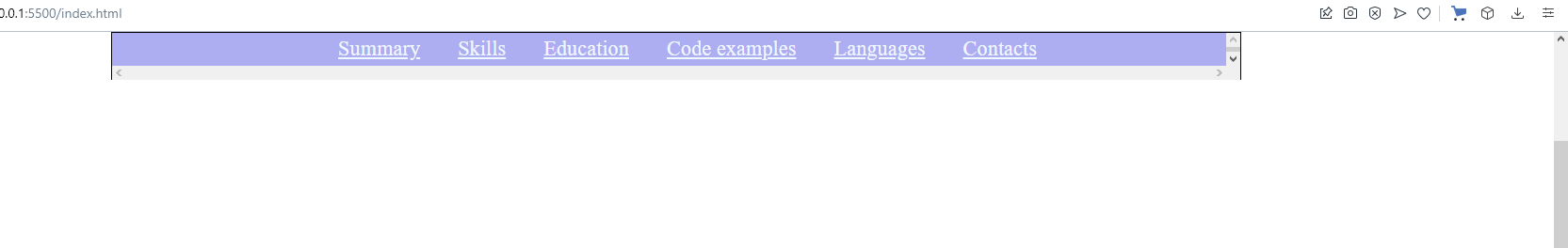
Получается, что панель выходит за пределы блока с классом .container
Ответы (1 шт):
Автор решения: tomato-magnet-regulato
→ Ссылка
Изменил только пару параметров в css - в итоге имеем, меню по центру, с шириной макс 1200px, при прокрутке, нав бар буд-то приклеен к верху.
Делается это с помощью position: -webkit-sticky; position: sticky; top: 0;
body {
  font: normal 16px/25px 'Times New Roman', 'Times', 'Georgia', serif;
  max-width: 1200px;
  height: 1200px;
  margin: 0 auto;
}
.container{
  position: -webkit-sticky;
  position: sticky;
  top: 0;
  display: flex;
  flex-direction: column;
  border: solid 1px black;
  background-color: #F0F5F9;
  border-bottom: none;
  border-top: none;
}
.nav{

  background-color:rgb(173, 173, 241);
  width: inherit;
  height: 50px;
  display: flex;
  flex-wrap: wrap;
  flex-direction: column;
  justify-content: center;
  border-top: solid 1px black;
  overflow: scroll;
}

.menu-btn {
  width: 30px;
  height: 30px;
  position: fixed;
  right: 0;
  margin-right: 50px;
  z-index: 3;
  overflow: hidden;
  display: none;

}

.nav-list {
  display: flex;
  flex-wrap: wrap;
  justify-content: center;
}

.nav li {
  list-style-type: none;
}
.nav-items{
  text-decoration: none;
  margin: 0 20px;
}
.nav-link{
  color: aliceblue;
  font-size: 1.4em;
}
.nav-link:hover{
  color: #424874;
}