Как верстать такие блоки?
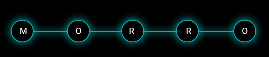
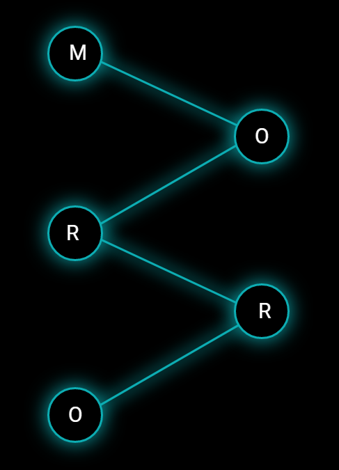
Как лучше верстать подобное? Я думал сделать у .work__box линии по примеру как в этом вопросе через ::before & ::after, у первого и последнего удалить лишние чтобы осталось по одной. А при уменьшении экрана через trasform вращать их уже чтобы было как на картинке. Но тут почему то не работает такая история с флексом как там с заголовком.
Картинками на фоне думаю плохое решение будет.
body {
  font-family: 'Roboto', Arial, sans-serif;
  color: #fff;
  background-color: #000;
  font-size: 15px;
  padding: 0;
  margin: 0;
  overflow-x: hidden;
}

.container {
  width: 1140px;
  margin: 0 auto;
}

.wrapper {
  display: flex;
  justify-content: space-between;
}

.work__box {
  max-width: 215px;
}

.work__box:before,
.work__box:after {
  content: "";
  width: 100%;
  display: inline-block;
  vertical-align: middle;
  background-color: #0dadb3;
  box-shadow: 0px 0px 25px 2px rgb(13 173 179);
  height: 3px;
}

.work__box-header {
  position: relative;
  border-width: 3px;
  border-radius: 3000px;
  background-color: #000000;
  background-position: center center;
  border-color: #0dadb3;
  border-style: solid;
  box-shadow: 0px 0px 30px 0px rgb(13 173 179);
  height: 100px;
  width: 100px;
  line-height: 1;
  font-weight: 400;
  font-size: 30px;
  display: flex;
  align-items: center;
  justify-content: center;
  margin-bottom: 20px;
}


/* 992px - 1200px */

@media screen and (max-width: 1200px) {
  .container {
    width: 960px;
  }
}


/* 768px - 992px */

@media screen and (max-width: 992px) {
  .container {
    width: 720px;
  }
  .wrapper {
    flex-direction: column;
    align-items: center;
  }
}


/* 576px - 768px */

@media screen and (max-width: 768px) {
  .container {
    width: 540px;
  }
}


/* 320px - 576px */

@media screen and (max-width: 576px) {
  .container {
    width: 90%;
  }
}
<!DOCTYPE html>
<html lang="en">
<head>
<meta charset="UTF-8">
<meta http-equiv="X-UA-Compatible" content="IE=edge">
<meta name="viewport" content="width=device-width, initial-scale=1.0">
<title>Document</title>
</head>
<body>
<section id="work" class="work anchor">
<div class="container">
<div class="wrapper">
<div class="work__box">
<div class="work__box-header t1">M</div>
</div>
<div class="work__box">
<div class="work__box-header">O</div>
</div>
<div class="work__box">
<div class="work__box-header">R</div>
</div>
<div class="work__box">
<div class="work__box-header">R</div>
</div>
<div class="work__box">
<div class="work__box-header t5">O</div>
</div>
</div>
</div>
</section>
</body>
</html>Ответы (1 шт):
Автор решения: UserTest013
→ Ссылка
const wrapper = document.querySelector('.wrapper');
const workBoxHeaders = [...wrapper.querySelectorAll('.work__box-header')];
const originLine = wrapper.querySelector('#line');

window.addEventListener('resize', init);

init();

function init() {
  cleanup();
  for (let index = 0; index < workBoxHeaders.length - 1; index++) {
    drawLine(workBoxHeaders[index], workBoxHeaders[index + 1]);
  }
}

function cleanup() {
  const lines = [...svg.querySelectorAll('.visible')];
  for (const line of lines) {
    line.remove();
  }
}

function drawLine(elemFrom, elemTo) {
  const from = elemFrom.getBoundingClientRect();
  const to = elemTo.getBoundingClientRect();
  const rect = wrapper.getBoundingClientRect();
  const clonedLine = originLine.cloneNode(true);
  clonedLine.classList.add('visible');
  clonedLine.setAttribute('x1', from.left + from.width / 2 - rect.left);
  clonedLine.setAttribute('y1', from.top + from.height / 2 - rect.top);
  clonedLine.setAttribute('x2', to.left + to.width / 2 - rect.left);
  clonedLine.setAttribute('y2', to.top + to.height / 2 - rect.top);
  originLine.parentNode.appendChild(clonedLine);
}
* {
margin: 0;
padding: 0;
}
.wrapper {
position: relative;
display: flex;
justify-content: space-between;
align-items: center;
padding: 1em;
gap: 1em;
font-size: 2rem;
}
.work__box {
display: flex;
}
.work__box-header {
display: flex;
justify-content: center;
align-items: center;
width: 2em;
aspect-ratio: 1 / 1;
border: 2px solid black;
border-radius: 2em;
background: white;
}
#svg {
position: absolute;
inset: 0;
width: 100%;
height: 100%;
z-index: -1;
}
#line {
stroke-width: 2px;
stroke: rgb(0, 0, 0);
}
@media (max-width: 700px) {
.wrapper {
flex-direction: column;
align-items: stretch;
}
.work__box:nth-child(2n) {
justify-content: flex-end;
}
}<div class="wrapper">
<div class="work__box">
<div class="work__box-header">M</div>
</div>
<div class="work__box">
<div class="work__box-header">O</div>
</div>
<div class="work__box">
<div class="work__box-header">R</div>
</div>
<div class="work__box">
<div class="work__box-header">R</div>
</div>
<div class="work__box">
<div class="work__box-header">O</div>
</div>
<svg id="svg" preserveAspectRatio="none">
<line id="line" stroke="black"/>
</svg>
</div>