Использование css переменных
Верстаю фигмовский макет Webovio. Интересует верстка блока 04 Services
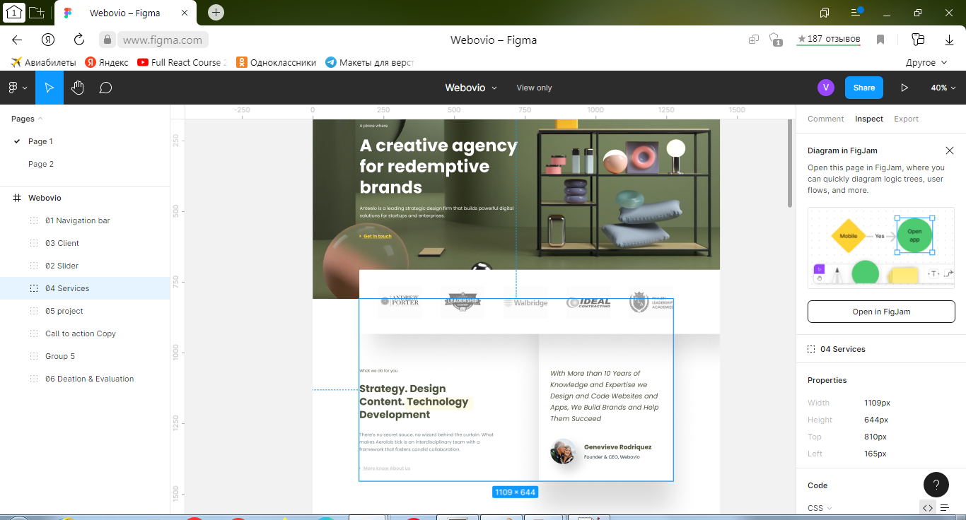
Изображение из этого блока

Есть код этого блока
:root {
  --figma-windowwidth: 1440px;
  --figma-headerheight: 810px;
  --my-windowwidth: 1366px;
  --my-headerheight: 768px;
  --figma-serviceswidth: 1109px;
  --figma-servicesarticlewidth: 635px;
  --figma-servicescommentwidth: 474px;
  --figma-servicespaddingwidth: 160px;
}

body {
  margin: 0;
  padding: 0;
}

.wrapper {
  min-height: 100%;
  overflow: hidden;
}

.page__company-articles {}

.company-articles {}

.company-articles__container {}

.articles__block_container {
  max-width: /*1140px;*/
  calc((var(--figma-serviceswidth)/var(--figma-windowwidth))*var(--my-windowwidth));
  margin: 0 auto;
  /*margin: 0 -100px;*/
  /*position: absolute;
  left: 0;
  right: 0;*/
  /*top: 0;*/
}

.article__and__comment {
  color: rgba(33, 56, 66, 0.6);
  display: flex;
  justify-content: space-between;
  flex-wrap: wrap;
  /*margin-left: calc(165/1441*100vw);*/
  /*166/1441*100vw*/
  /*margin-right: calc(166/1441*100vw);*/
  /*166/1441*100vw*/
}

.main-article {
  flex: 0 1 calc(50%-79.5px);
  /*padding-right: 100px;*/
  padding-right: 80px;
}

.article__first-note {
  margin-top: 120px;
  /*120*/
  /*margin-left: 166px;*/
  font-family: 'Poppins';
  font-style: normal;
  font-weight: 400;
  font-size: 14px;
  line-height: 21px;
  color: rgba(77, 83, 60, 0.9);
}

.article__title {
  color: #4D533C;
  margin-top: calc(29px);
  /*margin-left: 166px;*/
  font-family: 'Poppins';
  font-style: normal;
  font-weight: 700;
  font-size: 36px;
  line-height: 46px;
}

.article__text {
  margin-top: calc(35px);
  /*margin-left: 166px;*/
  font-family: 'Poppins';
  font-style: normal;
  font-weight: 400;
  font-size: 16px;
  line-height: 26px;
  color: rgba(33, 56, 66, 0.6);
}

.article__second-note {
  margin-top: calc(42px);
  /*margin-left: 166px;*/
  font-family: 'FontAwesome';
  font-style: normal;
  font-weight: 400;
  font-size: 16px;
  line-height: 18px;
  text-decoration-line: underline;
  color: #D4D6D4;
}

.comment {
  flex: 0 1 calc(50%-80.5px);
  /*padding-left: 100px;*/
  box-shadow: 20px 25px 43px rgba(0, 0, 0, 0.18);
  /*padding: 0px 100px;*/
  padding-left: 80px;
}

.comment__text {
  margin-top: calc(120px);
  font-family: 'Poppins';
  font-style: italic;
  font-weight: 400;
  font-size: 24px;
  line-height: 40px;
  /* or 167% */
  color: #4D533C;
}

.icon__and__label {
  display: flex;
  align-items: center;
  flex-wrap: wrap;
  margin-top: calc(50px);
}

.comment__icon {
  /*margin-left: calc(40px);*/
}

.label {
  margin-top: calc(-50px);
  /*14px*/
  margin-left: calc(30px);
}

.comment__author {
  color: #4D533C;
  font-family: 'Poppins';
  font-style: normal;
  font-weight: 700;
  font-size: 22px;
  line-height: 33px;
  /* identical to box height */
  color: #4D533C;
}

.comment__author-position {
  font-family: 'Poppins';
  font-style: normal;
  font-weight: 400;
  font-size: 16px;
  line-height: 24px;
  /* identical to box height */
  color: #152934;
  padding-top: calc(6px);
}

@media (max-width: 1242px) {
  .main-article,
  .comment {
    flex: 0 1 100%;
    text-align: center;
    padding-left: 0px;
    padding-right: 0px;
  }
}
<section class="page__company-articles company-articles">
<div class="company-articles__container articles__block_container">
<div class="article__and__comment">
<article class="main-article">
<div class="article__first-note">What we do for you</div>
<div class="article__title">Strategy. Design Content. Technology Development </div>
<div class="article__text">There’s no secret sauce, no wizard behind the curtain. What makes Aerolab tick is an interdisciplinary team with a framework that fosters candid collaboration.</div>
<div class="article__second-note">More know About us</div>
</article>
<article class="comment">
<div class="comment__text">With More than 10 Years of Knowledge and Expertise we Design and Code Websites and Apps, We Build Brands and Help Them Succeed</div>
<div class="icon__and__label">
<div class="comment__icon">
<img src="img/articleicon/author__icon.png" alt="author">
</div>
<div class="label">
<div class="comment__author">Genevieve Rodriquez</div>
<div class="comment__author-position">Founder & CEO, Webovio</div>
</div>
</div>
</article>
</div>
</div>
</section>Я открыл эту страницу в браузере и обнаружил, что выражение max-width: /*1140px;*/ calc((var(--figma-serviceswidth)/var(--figma-windowwidth))*var(--my-windowwidth)); не было вычислено. В чем ошибка использования css переменных? Должно быть как на Фигмовский макет.
P.S. Я смотрел https://developer.mozilla.org/ru/docs/Web/CSS/calc#вложенный_calc_с_css_переменными - причины не нашел.
Ответы (1 шт):
Точно не знаю с чем это связано, по calc() не может выполнить вычисление из-за того, что значения не числа, а px.
Самый простой способ пофиксить - убрать px из переменных в :root
:root {
  --figma-windowwidth: 1440;
  --my-windowwidth: 1366;
  --figma-serviceswidth: 1109;
}

body {margin: 0;}

.articles__block_container {
  background: #ccc;
  max-width: calc(var(--figma-serviceswidth) / var(--figma-windowwidth) * var(--my-windowwidth) * 1px);
  height: 100vh;
  margin: 0 auto;
}
<section class="articles__block_container"></section>calc( ... * 1px) - * 1px позволяет конвертировать полученное число в единицу измерения CSS.