Пропорциональное масштабирование логотипа и бургера
Пытаюсь сверстать следующий макет Фигмовский макет. Есть следующий код
:root {
  /*фигмовские размеры*/
  --figma-windowwidth: 1440;
  --figma-headerheight: 810;
  /*размеры моего окна*/
  --my-windowwidth: 1366;
  --my-headerheight: 768;
  /*блочные размеры фигмовского макета*/
  --figma-serviceswidth: 1109;
  --figma-servicesarticlewidth: 635;
  --figma-servicescommentwidth: 474;
  --figma-servicespaddingwidth: 160;
}

body {
  margin: 0;
  padding: 0;
}

.wrapper {
  min-height: 100%;
  overflow: hidden;
}

.header {
  background-image: url('https://i.stack.imgur.com/R0Gxu.png');
  background-size: cover;
  background-repeat: no-repeat;
  background-position: center;
  width: 100%;
  display: block;
  position: relative;
  overflow: hidden;
  resize: horizontal;
}

.container {
  max-width: 1200px;
  margin: 0 auto;
  padding: 0 20px;
  position: absolute;
  left: 0;
  right: 0;
  top: 0;
}

.navigation {
  display: flex;
  align-items: center;
  justify-content: space-between;
  padding: 26px 0;
}

.logo {
  width: 258px;
  height: 40px;
  display: block;
  transition: 0.2s ease;
}

.logo:hover {
  opacity: 0.7;
}

.logo img {
  width: 100%;
  height: 100%;
  object-fit: contain;
}


/*
.logo::before {
  content: '';
  display: block;
  width: calc(258/1366 * 100%);
  height: 0;
  padding-top: calc(40 / 258 * 100%);
}
*/

.burger {
  width: 40px;
  height: 40px;
  flex-shrink: 0;
  background: #fff;
  border-radius: 40px;
  cursor: pointer;
  transition: 0.2s ease;
  display: flex;
  align-items: center;
  justify-content: center;
}

.burger svg {
  transition: 0.2s ease;
}

.burger:hover {
  background: #f0f0f0;
}

.burger:hover svg {
  fill: #555;
}

.header::before {
  content: '';
  display: block;
  width: 100%;
  height: 0;
  padding-top: calc(810 / 1440 * 100%);
}


/*
    Main content
*/

._icon_clients_container {
  /*margin-left: 166px;*/
}

.clients__items {
  display: flex;
  justify-content: space-between;
  align-items: center;
  flex-wrap: wrap;
  box-shadow: 50px 50px 100px rgba(0, 0, 0, 0.145947);
  background-color: rgba(255, 255, 255, 1)
}

.clients__item {
  flex: 0 1 20%;
  text-align: center;
}


/*
.clients__item img {
    width: 156px;
    height: 113px;
}
*/

@media (max-width: 779px) {
  .clients__item {
    flex: 0 1 25%;
    text-align: center;
  }
  /*
    .clients__item:last-child {
        flex: 1 1 100%;
    }
    */
  .clients__item:last-child {
    flex: 1 1 100%;
    text-align: center;
  }
}


/*
@media (max-width: 779px) {
    .clients__item:last-child {
        flex: 1 1 100%;
        display: flex;
        align-items: center;
    }
}
*/

@media (max-width: 623px) {
  .clients__item {
    flex: 0 1 calc(100%/3);
    text-align: center;
  }
  .clients__item:nth-last-child(-n+2) {
    flex: 1 1 50%;
    text-align: center;
  }
}

@media (max-width: 467px) {
  .clients__item {
    flex: 0 1 50%;
    text-align: center;
  }
  .clients__item:last-child {
    flex: 1 1 100%;
    text-align: center;
  }
}

@media (max-width: 311px) {
  .clients__item {
    flex: 0 1 100%;
    text-align: center;
  }
}


/* ==================================================================== */

.page__company-articles {}

.company-articles {}

.company-articles__container {}

.articles__block_container {
  max-width: calc((var(--figma-serviceswidth) / var(--figma-windowwidth)) * var(--my-windowwidth) * 1px);
  margin: 0 auto;
  /*margin: 0 -100px;*/
  /*position: absolute;
  left: 0;
  right: 0;*/
  /*top: 0;*/
}

.article__and__comment {
  color: rgba(33, 56, 66, 0.6);
  display: flex;
  justify-content: space-between;
  flex-wrap: wrap;
  /*margin-left: calc(165/1441*100vw);*/
  /*166/1441*100vw*/
  /*margin-right: calc(166/1441*100vw);*/
  /*166/1441*100vw*/
}

.main-article {
  flex: 0 1 calc(((var(--figma-serviceswidth) - var(--figma-servicespaddingwidth)) / 2) * (var(--my-windowwidth) / var(--figma-windowwidth)) * 1px/*+ 0.5px*/
  );
  /*padding-right: 100px;*/
  /*padding-right: calc((var(--figma-servicespaddingwidth) / 2) * (var(--my-windowwidth) / var(--figma-windowwidth)) * 1px);*/
  margin-right: calc((var(--figma-servicespaddingwidth)) * (var(--my-windowwidth) / var(--figma-windowwidth)) * 1px);
}

.article__first-note {
  margin-top: 120px;
  /*120*/
  /*margin-left: 166px;*/
  font-family: 'Poppins';
  font-style: normal;
  font-weight: 400;
  font-size: /*14px*/
  calc(14 * (var(--my-windowwidth) / var(--figma-windowwidth)) * 1px);
  line-height: 21px;
  color: rgba(77, 83, 60, 0.9);
}

.article__title {
  color: #4D533C;
  margin-top: calc(29px);
  /*margin-left: 166px;*/
  font-family: 'Poppins';
  font-style: normal;
  font-weight: 700;
  font-size: calc(36 * (var(--my-windowwidth) / var(--figma-windowwidth)) * 1px);
  line-height: 46px;
}

.article__text {
  margin-top: calc(35px);
  /*margin-left: 166px;*/
  font-family: 'Poppins';
  font-style: normal;
  font-weight: 400;
  font-size: calc(16 * (var(--my-windowwidth) / var(--figma-windowwidth)) * 1px);
  line-height: 26px;
  color: rgba(33, 56, 66, 0.6);
}

.article__second-note {
  margin-top: calc(42px);
  /*margin-left: 166px;*/
  font-family: 'FontAwesome';
  font-style: normal;
  font-weight: 400;
  font-size: /*16px*/
  calc(16 * (var(--my-windowwidth) / var(--figma-windowwidth)) * 1px);
  line-height: 18px;
  text-decoration-line: underline;
  color: #D4D6D4;
}

.comment {
  flex: 0 1 calc(((var(--figma-serviceswidth) - var(--figma-servicespaddingwidth)) / 2) * (var(--my-windowwidth) / var(--figma-windowwidth)) * 1px/*+ 0.5px*/
  );
  /*padding-left: 100px;*/
  box-shadow: 20px 25px 43px rgba(0, 0, 0, 0.18);
  /*padding: 0px 100px;*/
  /*padding-left: calc((var(--figma-servicespaddingwidth) / 2) * (var(--my-windowwidth) / var(--figma-windowwidth)) * 1px);*/
}

.comment__text {
  margin-top: calc(120px);
  font-family: 'Poppins';
  font-style: italic;
  font-weight: 400;
  font-size: /*24px*/
  calc(24 * (var(--my-windowwidth) / var(--figma-windowwidth)) * 1px);
  line-height: 40px;
  /* or 167% */
  color: #4D533C;
}

.icon__and__label {
  display: flex;
  align-items: center;
  flex-wrap: wrap;
  margin-top: calc(50px);
}

.comment__icon {
  /*margin-left: calc(40px);*/
}

.comment__icon img {
  /*
    width: calc(90 * (var(--my-windowwidth) / var(--figma-windowwidth)) * 1px);
    height: calc(90 * (var(--my-windowwidth) / var(--figma-windowwidth)) * 1px);
    */
}

.label {
  margin-top: calc(-50px);
  /*14px*/
  margin-left: calc(30px);
}

.comment__author {
  color: #4D533C;
  font-family: 'Poppins';
  font-style: normal;
  font-weight: 700;
  font-size: /*22px*/
  calc(22 * (var(--my-windowwidth) / var(--figma-windowwidth)) * 1px);
  line-height: 33px;
  /* identical to box height */
  color: #4D533C;
}

.comment__author-position {
  font-family: 'Poppins';
  font-style: normal;
  font-weight: 400;
  font-size: /*16px*/
  calc(16 * (var(--my-windowwidth) / var(--figma-windowwidth)) * 1px);
  line-height: 24px;
  /* identical to box height */
  color: #152934;
  padding-top: calc(6px);
}

@media (max-width: 1242px) {
  .main-article,
  .comment {
    flex: 0 1 100%;
    text-align: center;
    padding-left: 0px;
    padding-right: 0px;
  }
  .main-article {
    margin-right: 0px;
  }
  .comment {
    margin: 0px 10px;
  }
}


/* =================================================================== */

.page__description {
  margin-top: calc(200px);
  /*335px*/
}

.description {}

.description__container {}

.description__block_container {}

.description__industry {
  display: flex;
  /*justify-content: space-between;*/
  width: 100%;
  align-items: center;
  flex-wrap: wrap;
  /*max-width: 1026px;*/
}

.description__industry-title {
  /*flex: 0 1 calc(100%/3);*/
  color: rgba(77, 83, 60, 1);
  /*padding-left: calc(100/1441*100vw);*/
  margin-left: calc((165 / var(--figma-windowwidth)) * var(--my-windowwidth) * 1px);
  flex: 0 1 calc((340 / var(--figma-windowwidth)) * var(--my-windowwidth) * 1px);
  font-family: 'Poppins';
  font-style: normal;
  font-weight: 700;
  font-size: /*36px*/
  calc((36 / var(--figma-windowwidth)) * var(--my-windowwidth) * 1px);
  line-height: 54px;
  color: #4D533C;
}

.description__industry-text {
  flex: 0 1 calc((518 / var(--figma-windowwidth)) * var(--my-windowwidth) * 1px);
  padding-top: 12px;
  /* 133/1441*100vw */
  padding-bottom: 12px;
  margin-left: calc((133 / var(--figma-windowwidth)) * var(--my-windowwidth) * 1px);
  /*343*/
  color: rgba(33, 56, 66, 0.6);
  font-family: 'Poppins';
  font-style: normal;
  font-weight: 400;
  font-size: /*16px*/
  calc((16 / var(--figma-windowwidth)) * var(--my-windowwidth) * 1px);
  line-height: 26px;
  /* or 162% */
  /*max-width: calc(518/1441*100vw);*/
}

@media (max-width: 1096px
/*830px*/

) {
  .description__industry-title,
  .description__industry-text {
    margin-left: 0px;
    margin-right: 0px;
    flex: 1 1 100%;
    text-align: center;
  }
  .description__industry-title {
    padding: 0px 0px 0px 0px;
  }
  .description__industry-text {
    padding: 12px 0px 12px 0;
  }
}


/* =================================================================== */

.techno-articles {
  margin-top: 104px;
}

.techno-articles__container {}

.techno__block_container {}

.techno-articles__items {}

.techno-article__item {}

.item__techno-article {}

.item__techno-article_example {}

.item__techno-article_content {
  display: flex;
  /*flex-wrap: wrap;
    justify-content: center;
    flex-direction: row;*/
}

@media (max-width: 696px) {
  .item__techno-article_content {
    flex-wrap: wrap;
  }
  .item__techno-article_image {
    flex: 1 1 100%;
  }
  .item__techno-article_body {
    flex: 1 1 100%;
    padding-left: 0;
  }
}

.item__techno-article_image {
  flex: 0 0 calc(735/1441*100%);
  /*calc(735/1441*100%)*/
  position: relative;
  padding: 0px 0px calc(550/1441*100%) 0px;
}

.item__techno-article_image img {
  position: absolute;
  width: 100%;
  height: 100%;
  top: 0;
  left: 0;
  object-fit: cover;
}

.item__techno-article_body {
  flex: 1 1 auto;
  padding-top: 80px;
  padding-left: calc(96/1441*100vw);
  /*136*/
  padding-right: calc(133/1441*100vw);
  /*110*/
}

.item__techno-article_title {
  color: rgba(77, 83, 60, 1);
  font-family: 'Poppins';
  font-style: normal;
  font-weight: 700;
  font-size: 36px;
  line-height: 48px;
  /* or 133% */
  color: #4D533C;
}

.item__techno-article_text {
  padding-top: 24px;
  color: rgba(33, 56, 66, 0.6);
  font-family: 'Poppins';
  font-style: normal;
  font-weight: 400;
  font-size: 16px;
  line-height: 26px;
  /* or 162% */
  color: rgba(33, 56, 66, 0.6);
}

.item__techno-article_link {
  color: rgba(33, 56, 66, 0.6);
}

.item__techno-article_comment {
  color: #4D533C;
  background-color: #fff;
  box-shadow: 50px 50px 100px rgba(0, 0, 0, 0.145947);
  border-radius: 8px;
  position: relative;
  z-index: 400;
  margin: -158px calc(664/1441*100vw) 0px calc(323/1441*100vw);
  /*604*/
  width: calc(453/1441*100vw);
}

.item__techno-article_comment_ownership {
  display: flex;
  align-items: center;
  padding-left: 30px;
}

.item__techno-article_comment_author_image {
  width: 90px;
  height: 90px;
}

.item__techno-article_comment_text {
  font-family: 'Poppins';
  font-style: italic;
  font-weight: 400;
  font-size: 16px;
  line-height: 26px;
  padding-top: 30px;
  padding-left: 30px;
  padding-right: 33px;
}

.item__techno-article_comment_author {
  font-family: 'Poppins';
  font-style: normal;
  font-weight: 700;
  font-size: 16px;
  line-height: 24px;
}

.item__techno-article_comment_author_position {
  font-family: 'Poppins';
  font-style: normal;
  font-weight: 400;
  font-size: 14px;
  line-height: 21px;
  /* identical to box height */
  color: #152934;
}

.item__techno-article_text>*:not(:last-child) {
  margin-bottom: 36px;
}

.item__techno-article_link {
  margin-top: 90px;
}
<!DOCTYPE html>
<html lang="en">
<head>
<meta charset="UTF-8">
<meta http-equiv="X-UA-Compatible" content="IE=edge">
<link href="https://fonts.googleapis.com/css?family=Poppins:regular,700&display=swap" rel="stylesheet" />
<meta name="viewport" content="width=device-width, initial-scale=1.0">
<link rel="stylesheet" href="style.css">
<title>Webovio</title>
</head>
<body>
<div class="wrapper">
<header class="header">
<div class="container">
<div class="navigation">
<a href="#" class="logo">
<img src="https://svgur.com/i/jAx.svg" alt="Logo" />
</a>
<div class="burger">
<svg width="18" height="13" viewBox="0 0 18 13">
<path fill-rule="evenodd" clip-rule="evenodd" d="M0 0V1.8H18V0H0ZM0 5.4V7.2H18V5.4H0ZM0 12.6V10.8H18V12.6H0Z" />
</svg>
</div>
</div>
</div>
</header>
<main class="page">
<div class="page__clients clients">
<div class="clients__container _icon_clients_container">
<div class="clients__items">
<div class="clients__item">
<img src="img/clients/Andrew-Porter-Logo.png" alt="clients">
</div>
<div class="clients__item">
<img src="img/clients/Jalen-Rose-Leadership-Academy-Logo.png" alt="clients">
</div>
<div class="clients__item">
<img src="img/clients/Wal.png" alt="clients">
</div>
<div class="clients__item">
<img src="img/clients/Ideal.png" alt="clients">
</div>
<div class="clients__item">
<img src="img/clients/PhalenLeadership.png" alt="clients">
</div>
</div>
</div>
</div>
<section class="page__company-articles company-articles">
<div class="company-articles__container articles__block_container">
<div class="article__and__comment">
<article class="main-article">
<div class="article__first-note">What we do for you</div>
<div class="article__title">Strategy. Design Content. Technology Development </div>
<div class="article__text">There’s no secret sauce, no wizard behind the curtain. What makes Aerolab tick is an interdisciplinary team with a framework that fosters candid collaboration.</div>
<div class="article__second-note">More know About us</div>
</article>
<article class="comment">
<div class="comment__text">With More than 10 Years of Knowledge and Expertise we Design and Code Websites and Apps, We Build Brands and Help Them Succeed</div>
<div class="icon__and__label">
<div class="comment__icon">
<img src="img/articleicon/author__icon.png" alt="author">
</div>
<div class="label">
<div class="comment__author">Genevieve Rodriquez</div>
<div class="comment__author-position">Founder & CEO, Webovio</div>
</div>
</div>
</article>
</div>
</div>
</section>
<section class="page__description description">
<div class="description__container description__block_container">
<div class="description__industry">
<div class="description__industry-title">
We Have Some Awesome Project.
</div>
<div class="description__industry-text">
Lorem Ipsum is simply dummy text of the printing and typesetting industry. Lorem Ipsum has been the industry's standard dummy text ever since the 1500s,
</div>
</div>
</div>
</section>
<section class="techno-articles">
<div class="techno-articles__container techno__block_container">
<div class="techno-articles__items">
<div class="techno-article__item item__techno-article">
<div class="item__techno-article_example">
<div class="item__techno-article_content">
<div class="item__techno-article_image">
<img src="img/futurearticlesimages/technoDVD.png" alt="technoDVD">
</div>
<div class="item__techno-article_body">
<div class="item__techno-article_title">The wall new Balenciaga.com</div>
<div class="item__techno-article_text">
<p class="first__p">This article is floated online with an aim to help you find the best dvd printing solution.</p>
<p class="second__p">Dvd printing is an important feature used by large and small DVD production houses to print information on DVDs.</p>
</div>
<div class="item__techno-article_link">See Case Study</div>
</div>
</div>
<div class="item__techno-article_comment">
<div class="item__techno-article_comment_text">
“In my history of working with trade show vendors, I can honestly say that there is not one company that I've ever worked with that has better service than Exhibit Systems.”
</div>
<div class="item__techno-article_comment_ownership">
<div class="item__techno-article_comment_author_image">
<img src="img/authors/author1.png" alt="Author comment">
</div>
<div class="item__techno-article_comment_author_info">
<div class="item__techno-article_comment_author">Angel Armstrong</div>
<div class="item__techno-article_comment_author_position">Founder & CEO, Google</div>
</div>
</div>
</div>
</div>
</div>
</div>
</div>
</section>
</main>
</div>
</body>
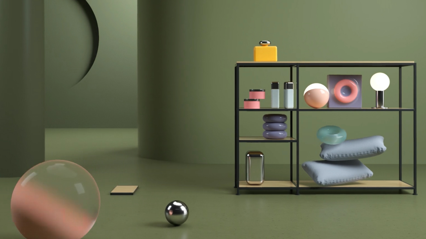
</html>Есть следующий фоновый рисунок
При уменьшении экрана логотип увеличивается, а необходимо, чтобы он пропорционально уменьшался. Привожу скриншоты

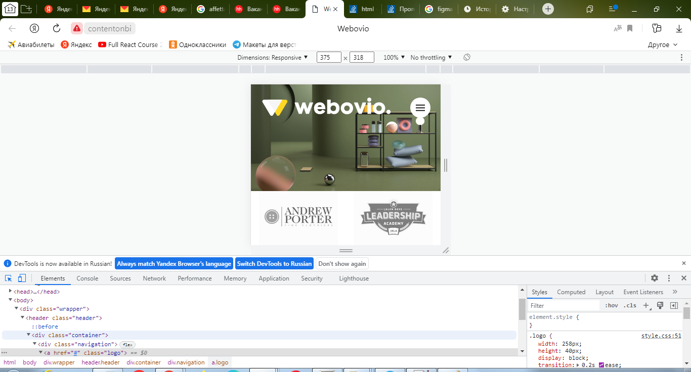
- Подскажите как добиться пропорционального масштабирования логотипа.
- Как добиться пропорционального масштабирования бургера?
Ответы (1 шт):
Автор решения: junta power
→ Ссылка
кастыльные варианты, но вдруг помогут)))
вариант 1):
logo {
  width: 8%;
  height: 100%;
  margin: 0 20px 0 0;
  position: relative;
}

logo::after {
  content: "";
  display: block;
  padding-bottom: 100%;
}
<div class="wrapper">
<img class="logo" src="../someimage" alt="Logo">
</div>вариант 2):
@media only screen and (max-width: 1920px) {
  logo {
    width: 50px;
    height: 50px;
  }
}

@media only screen and (max-width: 1280px) {
  logo {
    width: 40px;
    height: 40px;
  }
}

@media only screen and (max-width: 861px) {
  logo {
    width: 30px;
    height: 30px;
  }
}

@media only screen and (max-width: 320px) {
  logo {
    width: 15px;
    height: 15px;
  }
}