Как отцентрировать блок внутри блока с абсолютным позиционированием?
Написал для примера такой код:
.one {
  position: relative;
  width: 350px;
  height: 350px;
  background: #0f0;
}

.onea {
  float: left;
  position: static;
  width: 33.3%;
  height: 100px;
  background: #f0f;
  word-wrap: break-word;
}

.twoa {
  float: left;
  position: relative;
  width: 33.3%;
  height: 100px;
  background: #ff0;
}

.threea {
  float: left;
  position: relative;
  width: 33.3%;
  height: 100px;
  background: #f70;
}

.foura {
  position: absolute;
  bottom: 0;
  width: 100%;
  height: 100px;
  background: #000;
}

.oneaa {
  background: #095;
  text-align: center;
}
<!DOCTYPE html>
<html>
<body>
<div class="one">
<div class="onea">111</div>
<div class="twoa">222</div>
<div class="threea">333</div>
<div class="foura">
<div class="oneaa">111111111111</div>
</div>
</div>
</body>
</html>Получается такой результат:
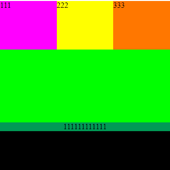
Как отцентрировать блок внутри блока с абсолютным позиционированием? Т.е. блок с классом oneaa должен вертикально отцентрироваться внутри блока с классом foura.
Если можно, приведите несколько вариантов вертикального центрирования данного блока.
Ответы (3 шт):
Как отцентрировать блок внутри блока с абсолютным позиционированием? Т.е. блок с классом oneaa должен вертикально отцентрироваться внутри блока с классом foura.
Нужно такое?
.one {
  position: relative;
  width: 350px;
  height: 350px;
  background: #0f0;
}

.onea {
  float: left;
  position: static;
  width: 33.3%;
  height: 100px;
  background: #f0f;
  word-wrap: break-word;
}

.twoa {
  float: left;
  position: relative;
  width: 33.3%;
  height: 100px;
  background: #ff0;
}

.threea {
  float: left;
  position: relative;
  width: 33.3%;
  height: 100px;
  background: #f70;
}

.foura {
  position: absolute;
  bottom: 0;
  width: 100%;
  height: 100px;
  background: #000;
  /* Добавить */
  display: flex;
  flex-direction: column;
  justify-content: center;
}

.oneaa {
  background: #095;
  text-align: center;
  align-items: center;
}
<!DOCTYPE html>
<html>
<body>
<div class="one">
  <div class="onea">111</div>
  <div class="twoa">222</div>
  <div class="threea">333</div>
  <div class="foura">
    <div class="oneaa">111111111111</div>
  </div>
</div>
</body>
</html>.one {
position: relative;
width: 350px;
height: 350px;
background: #0f0;
}
.onea {
float: left;
position: static;
width: 33.3%;
height: 100px;
background: #f0f;
word-wrap: break-word;
}
.twoa {
float: left;
position: relative;
width: 33.3%;
height: 100px;
background: #ff0;
}
.threea {
float: left;
position: relative;
width: 33.3%;
height: 100px;
background: #f70;
}
.foura {
display: flex;
align-items: center;
justify-content: center;
position: absolute;
bottom: 0;
width: 100%;
height: 100px;
background: #000;
}
.oneaa {
flex-grow: 1;
background: #095;
text-align: center;
}<div class="one">
<div class="onea">111</div>
<div class="twoa">222</div>
<div class="threea">333</div>
<div class="foura">
<div class="oneaa">111111111111</div>
</div>
</div>или:
.one {
  position: relative;
  width: 350px;
  height: 350px;
  background: #0f0;
}

.onea {
  float: left;
  position: static;
  width: 33.3%;
  height: 100px;
  background: #f0f;
  word-wrap: break-word;
}

.twoa {
  float: left;
  position: relative;
  width: 33.3%;
  height: 100px;
  background: #ff0;
}

.threea {
  float: left;
  position: relative;
  width: 33.3%;
  height: 100px;
  background: #f70;
}

.foura {
  display: grid;
  position: absolute;
  bottom: 0;
  width: 100%;
  height: 100px;
  background: #000;
}

.oneaa {
  align-self: center;
  background: #095;
  text-align: center;
}
<div class="one">
<div class="onea">111</div>
<div class="twoa">222</div>
<div class="threea">333</div>
<div class="foura">
<div class="oneaa">111111111111</div>
</div>
</div>Решение 1
.one {
position: relative;
width: 350px;
height: 350px;
background: #0f0;
}
.onea {
float: left;
position: static;
width: 33.3%;
height: 100px;
background: #f0f;
word-wrap: break-word;
}
.twoa {
float: left;
position: relative;
width: 33.3%;
height: 100px;
background: #ff0;
}
.threea {
float: left;
position: relative;
width: 33.3%;
height: 100px;
background: #f70;
}
.foura {
position: absolute;
bottom: 0;
width: 100%;
height: 100px;
background: #000;
}
.oneaa {
background: #095;
text-align: center;
top: calc(50% - .5em);
position: absolute;
width: 100%;
}<!DOCTYPE html>
<html>
<body>
<div class="one">
  <div class="onea">111</div>
  <div class="twoa">222</div>
  <div class="threea">333</div>
  <div class="foura">
    <div class="oneaa">111111111111</div>
  </div>
</div>
</body>
</html>Объяснение 1
Я добавил к .oneaa пропорцию top, со значением: calc(50% - 0.5em), это конструкция значит это: подвинуть вниз на 50% - половина размера шрифта. А чтобы top работал я добавил пропорцию position: absolute; и т.к. один из родителей имеет position: relative, позиционирование ведётся относительно этого родителя. И также добавил width: 100%;, чтобы блок был во всю ширину родительского блока.
Решение 2
.one {
  position: relative;
  width: 350px;
  height: 350px;
  background: #0f0;
}

.onea {
  float: left;
  position: static;
  width: 33.3%;
  height: 100px;
  background: #f0f;
  word-wrap: break-word;
}

.twoa {
  float: left;
  position: relative;
  width: 33.3%;
  height: 100px;
  background: #ff0;
}

.threea {
  float: left;
  position: relative;
  width: 33.3%;
  height: 100px;
  background: #f70;
}

.foura {
  position: absolute;
  bottom: 0;
  width: 100%;
  height: 100px;
  background: #000;
}

.oneaa {
  background: #095;
  text-align: center;
  transform: translateY(calc(50px - .5em));
}
<!DOCTYPE html>
<html>
<body>
<div class="one">
<div class="onea">111</div>
<div class="twoa">222</div>
<div class="threea">333</div>
<div class="foura">
<div class="oneaa">111111111111</div>
</div>
</div>
</body>
</html>Объяснение 2
С помощью transform, я подвинул элемент на 50 пикселей вниз (это половина высоты от родительского блока .foura) и от 50 пиклесей я также отнял половину высоты .oneaa, т.к. вы нигде не задаёте высоту .oneaa, то её высоту составляет шрифт, а 1em = 1 кратный размер шрифта в пикселях, то есть берём половину 0.5em и получаем ровно половину от блока .oneaa.
Решение 3
.one {
  position: relative;
  width: 350px;
  height: 350px;
  background: #0f0;
}

.onea {
  float: left;
  position: static;
  width: 33.3%;
  height: 100px;
  background: #f0f;
  word-wrap: break-word;
}

.twoa {
  float: left;
  position: relative;
  width: 33.3%;
  height: 100px;
  background: #ff0;
}

.threea {
  float: left;
  position: relative;
  width: 33.3%;
  height: 100px;
  background: #f70;
}

.foura {
  position: absolute;
  bottom: 0;
  width: 100%;
  height: 100px;
  background: #000;
}

.oneaa {
  background: #095;
  text-align: center;
  margin-top: calc(50px - .5em);
}
<!DOCTYPE html>
<html>
<body>
<div class="one">
<div class="onea">111</div>
<div class="twoa">222</div>
<div class="threea">333</div>
<div class="foura">
<div class="oneaa">111111111111</div>
</div>
</div>
</body>
</html>Объяснение 3
Можно тоже самое сделать с margin-top, подвинуть вниз на половину высоту блока и т.д., но я не рекомендую такой способ, он менее производителен чем transform: translate. Это будет более, если вы будете двигать свои блоки, или фиксировать их на экране. Но если блоки у вас абсолютно точно будет статичные, тогда можете спокойно использовать этот способ, т.к. он короче (и красивей /imho) и поддерживается более большим кол-вом браузеров.